
A PR reporting dashboard shows that your campaign earned coverage in Forbes, Business Insider, and three industry publications this month; you know it worked. But your CMO wants something she can share with the board next week.
If you are still building that report manually from a Word document and scattered spreadsheets, you already feel the problem.
A PR reporting dashboard changes all of that. It is a centralized, visual interface that consolidates your key PR metrics into a single view, one that tells the story of your campaign’s performance clearly, quickly, and credibly.
The right PR reporting dashboard does more than organize data.
It connects your PR activities to business outcomes in language that every stakeholder, from your CMO to your CFO to the board, understands, without needing a background in public relations.
However, most teams still build reports manually from scattered data sources, which means they spend more time assembling information than analyzing and acting on it.
This article gives you the complete framework: what a strong PR reporting dashboard must include, which templates work best by audience type, and which PR analytics tools make the process reliable and repeatable.

What a PR Reporting Dashboard Must Include
Before choosing a template or a tool, you need to know exactly what your PR reporting dashboard should contain. Not every metric belongs on every dashboard.
However, there is a core set of data categories that every PR reporting dashboard must address to give stakeholders a complete and credible picture.
1. Media Coverage Overview
This is the first section any stakeholder looks at. It shows the raw output of your PR activity, how many pieces of coverage you earned, where they appeared, and what they said about your brand.
Your media coverage section should include:
- Total placements earned during the reporting period, separated by outlet type, national news, trade media, regional, blogs, and broadcast.
- Outlet quality indicators, domain authority score, estimated monthly readership, and topical relevance to your target audience for each key placement.
- Coverage tone – positive, neutral, or negative. Prowly’s April 2025 reporting guide recommends flagging the top five pieces of coverage by tone in every monthly report.
- Message pull-through rate- the percentage of your key messages that appeared accurately and clearly in the coverage earned.
- Highlight reel – a visual panel showing the most important three to five pieces of coverage for the period, with outlet names, headlines, and a brief note on business relevance.
Furthermore, include a trend line showing month-over-month progress. A single month of data tells one story.
Six months of trend data in your PR reporting dashboard tells a far more powerful story.
2. Sentiment Analysis
Sentiment is where your PR reporting dashboard shifts from output measurement to outcome measurement.
It answers not just where you appeared, but how you were perceived when you did.
Your sentiment section should include:
- Overall sentiment score – a percentage breakdown of positive, neutral, and negative mentions across all monitored channels during the reporting period.
- Sentiment trend over time – a line chart showing whether brand perception is improving, declining, or holding steady from month to month.
- Top positive mentions- the coverage and social mentions are actively building the most positive brand perception.
- Crisis flags – any negative coverage spikes that require strategic attention, with a contextual note and a recommended response action.
Additionally, track sentiment across earned media, social media, review platforms, and forums separately. A brand can have strong positive press coverage and quietly deteriorating sentiment on Reddit at the same time. Your PR reporting dashboard should surface both.
3. Share of Voice
Share of voice tells you how your brand’s media presence compares to your closest competitors during the reporting period.
It is one of the most valuable metrics in any PR reporting dashboard for connecting PR activity to competitive positioning.
The formula is: your brand mentions divided by total mentions of all tracked brands in your category, multiplied by 100.
This gives you a percentage showing how much of the conversation in your space belongs to your brand.
This section should show:
- Your current share of voice percentage versus the previous period, with a clear directional indicator.
- A competitor breakdown – typically a pie chart or stacked bar chart displaying each brand’s share.
- Share of voice by topic – which specific conversations your brand is winning and which ones competitors are dominating.
Consequently, when your PR reporting dashboard shows share of voice growing month over month, you have direct, visual proof that your PR investment is shifting market perception in your favor.
PR Reporting Dashboard: Recommended Sections, Metrics, and Frequency
| Media Coverage | Placements, outlet DA, reach, tone | Weekly |
| Sentiment Analysis | Positive/negative/neutral split, score trend | Weekly |
| Share of Voice | Brand vs. competitor SOV percentage | Monthly |
| Website Impact | Referral traffic, branded search, bounce rate | Monthly |
| Pipeline and Leads | PR-sourced leads, CRM attribution, CAC | Monthly |
| Campaign Progress | Goals vs. actuals, messages delivered | Per campaign |
Prowly PR Reporting Guide (Apr 2025), Brand24 PR Report Analysis (Nov 2025)
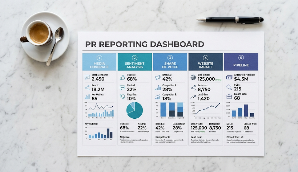
4. Website Impact from PR Activity
This section connects your earned media to measurable traffic and engagement on your own digital properties. It is where your PR reporting dashboard starts speaking the language of digital marketing and revenue teams, which matters when presenting to a CMO or CFO.
Include the following:
- Referral traffic from PR-driven sources – use UTM parameters on every press-featured URL so GA4 shows you exactly how many visitors came from each placement.
- Branded search volume trend – track this monthly in Google Search Console and include a trend line in your PR reporting dashboard showing month-over-month growth.
- Top PR-sourced landing pages – which pages on your site are receiving the most traffic from press coverage, and which content resonates most with press-sourced visitors.
- Conversion rate from PR-sourced traffic: if press-coverage visitors convert to leads at a higher rate than average traffic, that is one of the strongest PR ROI signals available to you.
Additionally, tracking time on site and pages per session for PR-sourced visitors separately demonstrates the quality difference earned media delivers compared to other channels.
5. Pipeline and Business Results
This final section is what separates a credible PR reporting dashboard from a good-looking collection of media highlights.
It connects everything above to the outcomes your leadership actually cares about.
Your pipeline section should include:
- PR-attributed leads: new leads in your CRM whose first touchpoint was press coverage, a PR-sourced referral, or a branded search triggered by media exposure.
- Pipeline influenced by PR: the total value of open or closed deals where a PR touchpoint appeared somewhere in the buyer journey, even if PR was not the final conversion point.
- Customer acquisition cost comparison: PRLab’s 2026 analysis consistently shows PR CAC running 40 to 60 percent below paid channel CAC for brands with regular press coverage.
- Deals closed with PR influence: any deals where the sales team noted that the prospect mentioned press coverage, recognized the brand from a feature, or arrived pre-informed about the company’s work.
These are the numbers that protect and grow your PR budget in any financial review.
PR Reporting Dashboard Templates by Audience
A single PR reporting dashboard does not serve every audience equally.
The metrics that matter to your CMO are different from what your CEO needs, and both are different from what your internal PR team uses day to day.
Here is how to structure your PR reporting templates by audience.
Executive Template: For CEOs and Boards
Executive dashboards should be reviewed monthly or quarterly and kept to a single page or slide.
Your CEO does not need every metric; they need the story. Where the brand stands, how it is trending, and what it means for the business.
Your executive PR reporting dashboard template should include:
- Top three to five media placements of the period — outlet name, headline, and a one-line note on business relevance.
- Share of voice trend — a simple chart showing your brand versus the two closest competitors over three to six months.
- Overall sentiment score — a single figure with a direction indicator showing whether perception is improving or declining.
- Pipeline influenced — a dollar figure showing the revenue value of deals where PR played a measurable role.
- One headline insight — the single most important takeaway from the period and its implication for the next quarter.
Above all, keep the visual design clean and minimal. Executive PR reporting dashboards loaded with charts lose their audience before the key points land.
One clear, well-sourced data point is worth more than a dozen cluttered ones.
CMO Template: For Marketing Leadership
CMO-level PR reporting dashboards go one level deeper, connecting brand and media metrics to marketing performance and competitive position. Review these monthly alongside your broader marketing data.
Include:
- Full share of voice breakdown by competitor and by topic area, with trend direction arrows.
- Message pull-through rate — the percentage of key messages that landed accurately in earned coverage.
- Referral traffic from earned media — monthly trend with source breakdown by outlet tier.
- Branded search volume trend from Google Search Console showing month-over-month growth.
- Sentiment trend across earned media and social channels separately.
- Content performance — which PR-linked assets on your website are driving the strongest engagement from press-sourced visitors?
Internal PR Team Template: For Operations
Your internal PR reporting dashboard is your operational tool.
It runs at a higher frequency, weekly or daily during active campaigns, and includes the granular data your team needs to make tactical decisions in real time.
Your internal template should include:
- Live media mention feed with real-time sentiment tags from your monitoring tool.
- Pitch activity tracker — pitches sent, journalist response rate, and placement conversion rate for the current campaign.
- Campaign progress against SMARTER objectives — targets that are specific, measurable, attainable, relevant, time-bound, ethical, and recorded, as defined by Axia PR’s November 2025 framework.
- Pending coverage pipeline — placements confirmed by journalists but not yet published.
- Competitor activity alerts — significant press coverage or announcements from competitor brands during the period.
Review your internal PR reporting dashboard at the start of every weekly team meeting.
It keeps the whole team aligned on what is working, what needs attention, and where to direct energy next.

PR Analytics Tools for Building Your Dashboard
A PR reporting dashboard is only as useful as the data feeding it. Here is a practical overview of the most reliable PR analytics tools available in 2026, matched to the sections of your dashboard they serve best.
- Brand24: best for media monitoring, sentiment analysis, and mention volume tracking. The Pro plan at $199 per month annually covers real-time alerts, AI sentiment scoring, and multi-source monitoring across news, social, blogs, podcasts, and newsletters. Ideal for small to mid-size teams building their first structured PR reporting dashboard.
- Prowly: best for PR reporting templates, journalist relationship tracking, and all-in-one PR management. The Essential bundle at $258 per month annually includes a drag-and-drop report builder that produces client-ready PR reporting dashboards without manual formatting.
- Google Analytics 4 (GA4): essential for tracking referral traffic from press coverage and measuring the conversion behavior of PR-sourced visitors. Free to use and non-negotiable for any PR reporting dashboard that connects earned media to website performance.
- Google Search Console: tracks branded search volume trends and organic impressions. Free and critical for demonstrating that your PR coverage is lifting top-of-funnel brand recognition over time.
- Semrush or Ahrefs: They are best for share of voice tracking, competitor media analysis, and domain authority monitoring. Both allow you to measure your SEO authority gains from press-earned backlinks.
- Meltwater or Cision: enterprise-grade PR analytics platforms best suited to large communications teams with global monitoring needs, multi-user access, and complex multi-stakeholder reporting requirements.
Overall, the right tool combination depends on team size and budget.
A startup can build a solid PR reporting dashboard using Brand24, GA4, Google Search Console, and Canva for the presentation layer.
An enterprise team needs Meltwater or Cision for data depth and Google Looker Studio to visualize it at scale.
Frequently Asked Questions
What should a PR reporting dashboard include?
A PR reporting dashboard should cover five core sections: media coverage overview, sentiment analysis, share of voice versus competitors, website impact from earned media, and pipeline or business results. The depth of each section varies by audience — executive dashboards need fewer, more strategic data points, while internal team dashboards need granular operational metrics reviewed weekly.
How often should you update a PR reporting dashboard?
Internal PR reporting dashboards should be reviewed weekly or daily during active campaigns. CMO-level dashboards are best reviewed monthly. Executive and board-level dashboards work best on a monthly or quarterly cadence. Axia PR’s November 2025 framework recommends monthly reviews with quarterly deep-dives and a comprehensive annual summary.
What is the best tool for building a PR reporting dashboard?
For small teams, Brand24 combined with GA4 and Google Search Console covers key data sources at an accessible cost. Mid-size agencies, Prowly’s built-in report builder produces client-ready PR reporting dashboards with minimal manual effort. For enterprise teams, Meltwater or Cision provides the most comprehensive data layer, best visualized in Google Looker Studio.
How do you connect a PR reporting dashboard to business outcomes?
Add a pipeline section that draws from your CRM. Use UTM parameters on all press-featured URLs so GA4 attributes traffic accurately. Tag inbound leads in your CRM by first-touch source. Track the share of voice monthly to show how PR is shifting your competitive position. These connections transform your PR reporting dashboard from a media report into a genuine business performance tool.
What is the share of voice in a PR reporting dashboard?
Share of voice is the percentage of total media coverage in your category that features your brand versus your competitors. Formula: your brand mentions divided by all tracked brand mentions in the category, multiplied by 100. A growing share of voice is one of the clearest signals in any PR reporting dashboard that your investment is working, and one of the easiest metrics to explain to any level of leadership.